
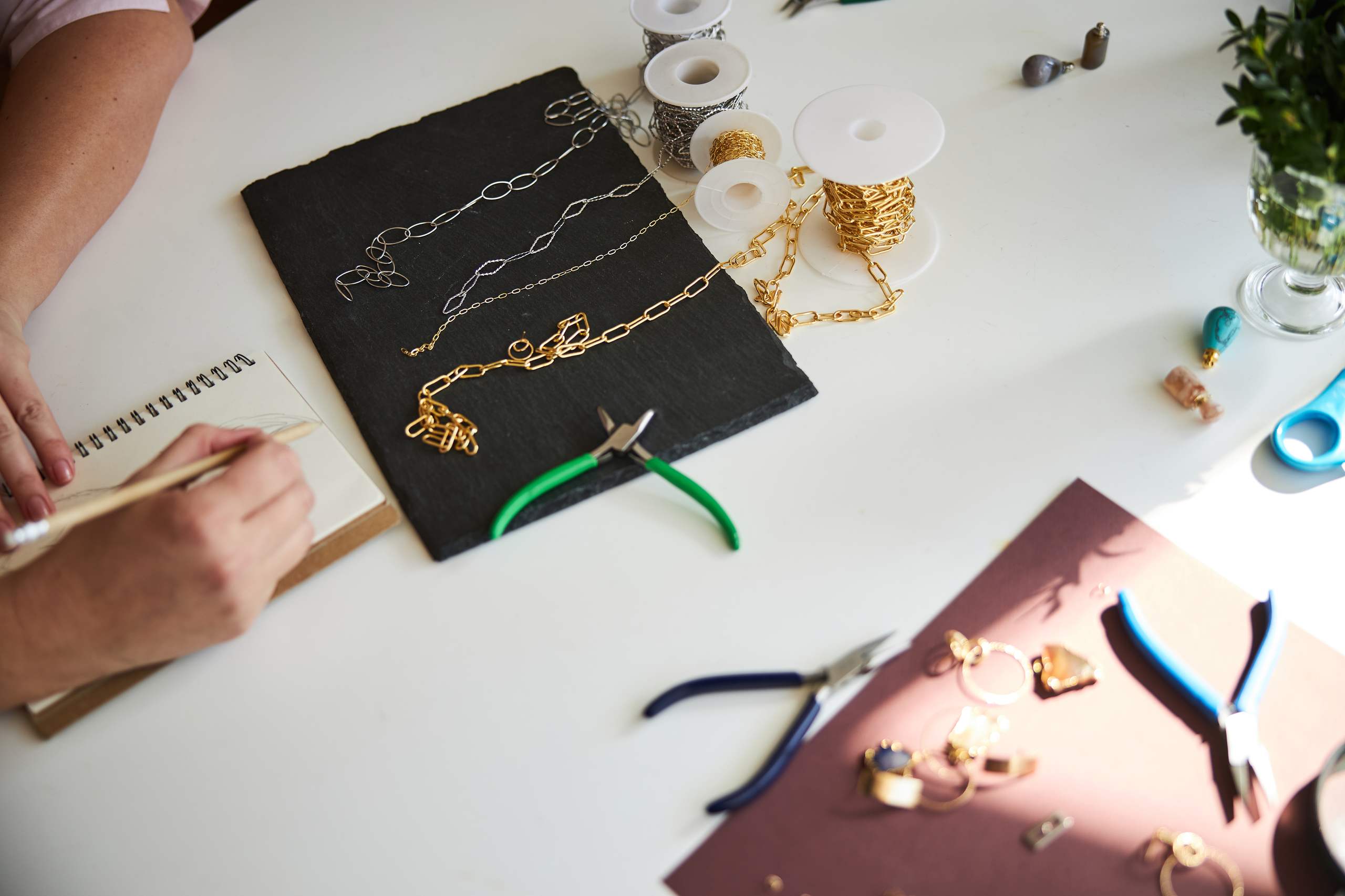
The term proportion in a design is used to describe the size of the parts of a design in relation to each other and the whole. To use a simple example, when creating a pendant, the design will be more balanced when the proportion between the main design element, the thickness of the frame around it, and the size of the chain are all in balance.
However, that’s not the whole story. As you continue to refine your design skills, you’ll discover many different ways to use proportion to create an attractive design. Proportion is one of those design concepts that’s a lot easier to learn when you understand the theory behind it. So let’s take a closer look at how proportion affects a design.
Work From Large Elements to Small Details
When creating a design, start by sketching a basic shape to get the overall silhouette you want before adding details. It’s much easier to determine if a design is out of proportion while it’s in the basic shape stage, before you become distracted by all the details.
After you have the overall shape balanced and proportional, it’s important to add all the main elements before incorporating the smaller details. The design may appear to be well balanced when you look at it without the intricate details added, but once all of the settings, smaller accent stones, or textural details have been added, the design might become unbalanced. In that case, it’s necessary to make adjustments to the larger elements before you go back in and add all of the detail.
Use Scale to Create Visual Focus
Scale is one way to show hierarchy within a design. Larger elements naturally attract the eye more than smaller elements, so if you want to create a design with one clear focal point, keep the other elements smaller than the focal element. If the other elements are larger, or even similar in scale to the focal element, the eye can become distracted and the design may appear unclear or cluttered.
Consider Negative Space
Negative space is an important factor when creating a balanced design. The empty space in a design allows the eye to take a rest. If you find that your design feels too busy, you may be able to create more balance by introducing some negative space. You can add more negative space to a design in a variety of ways. The easiest way is often to reduce the size of an element or the space between elements. You can also adjust the placement of elements. Negative space can help open up a piece to make it feel lighter. And a bonus of using negative space to correct a design is that the shapes themselves often don’t need to change.
Compare Different Variations
One of the best ways to develop an eye for scale is to create and compare different variations of a design. Keep the main shapes of the design similar and change the scale of some of the elements in each version, or alter the amount of space between elements.
By studying the results, you’ll start to understand the effect scale and proportion have on a design. Once your design is complete, be sure to look at it as a whole composition. Instead of evaluating it by studying each individual part, evaluate your design by looking at how well the parts work together. Do the individual elements work together and support the whole piece, or does one element compete for attention against the others? Does each element feel “correct” in scale to the other elements and the whole?
Practice Makes Proportion Easier
There are no specific rules for good proportion in a design; that makes it more of a creative challenge to develop an eye for it. Good proportion is meant to be felt, rather than noticed. When a design feels cohesive and balanced, it should draw attention to its overall beauty. Rather than to its scaling.
To build an eye for scale, study other designs and note the relative sizing between the parts and the whole piece. Create multiple sketch variations, and compare their results. Over time, you’ll develop an intuitive sense of proportion that makes it easier to balance designs as you create them.